
Re-imagining medication adherence
As part of a large digital enablement project for a pharmaceutical client, I led an end-to-end UX work-stream aiming to create the perfect digital companion for a medication pre-sorting and delivery service.
Role:
Lead designer
Co-product owner
Key contributions:
User research
Ideation workshop
Interface design
Product management

An app for pill boxes
According to the WHO, non-adherence can account for up to 125,000 deaths each year in the US and it is estimated that adherence to chronic medications is only about 50%. When I received a mission from a homecare & pharmacy client to design an app for the elderly to resolve this problem, I knew this was a tough UX challenge.

The pillbox
One of the most significant recent inventions in the pharmacy industry is the pillbox, which is made of small packets of pills prescribed for a patient.

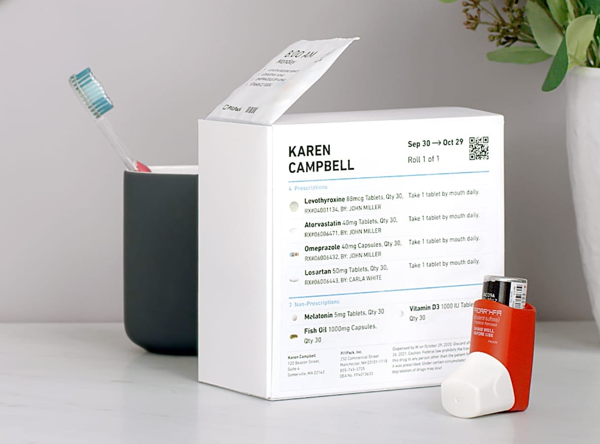
With these pre-packaging and shipping services, many patients have improved their medication adherence. However, with many pills inside a small packet comes inconveniences, such as patients not knowing which pill is for what, not being able to skip a specific pill, and difficulty updating the prescription…

From the initial user research, I learned that we needed to build an app that is trusted by the patients, non-intrusive, and helps them adhere to a healthier medication routine.
Planning for the MVP
Wayfinding in Miro?
Wayfinding is widely used in architecture and graphic design to help people navigate through physical spaces. However, as the digital world gets increasingly complex, designing good wayfinding systems in the virtual world became just as important. This is where I incorporated the color strips seen in many physical spaces into Miro, where people constantly get lost.
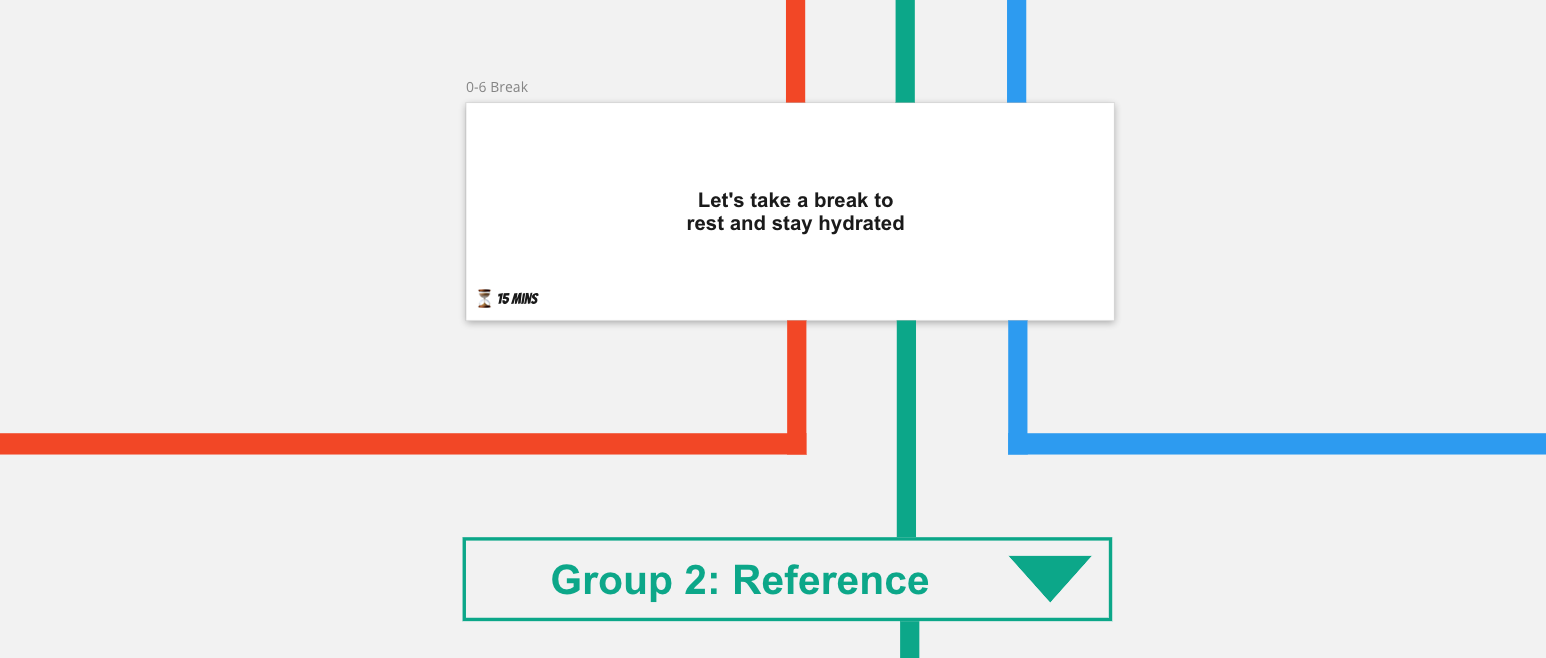
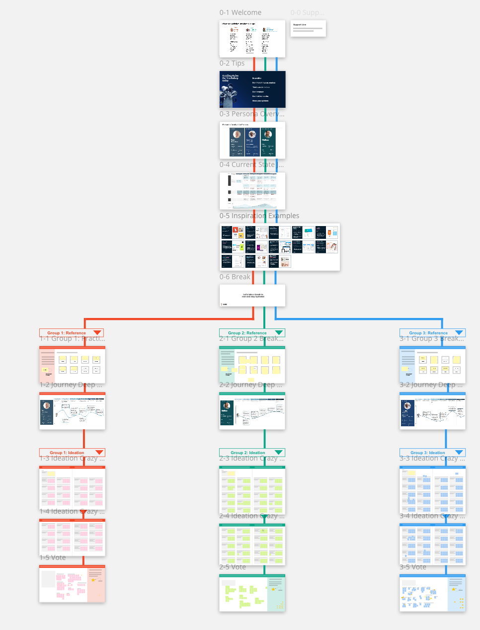
The result was more than ideal, with 28/30 participants successfully navigating through the entire session without issue and only 2 with problems with their Windows trackpad making them unable to scroll.
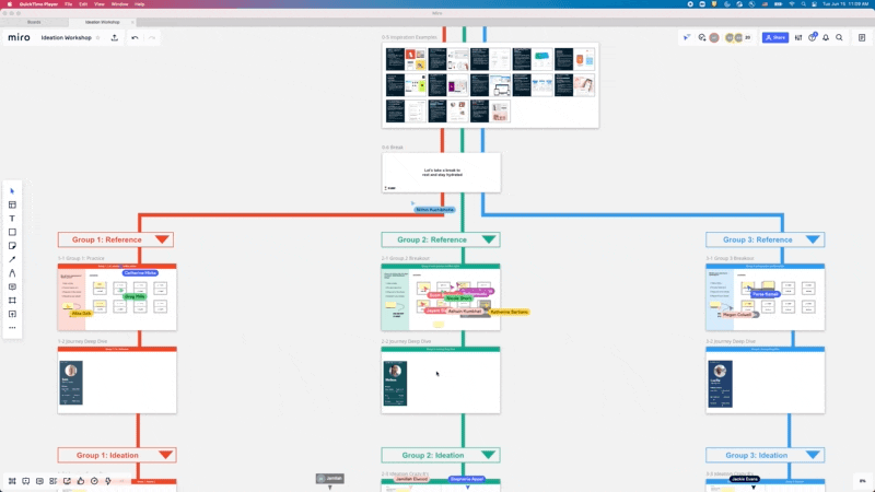
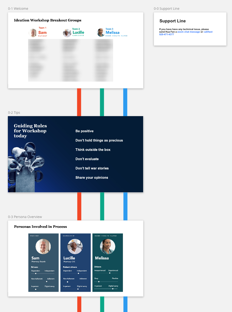
Ideation session - main view
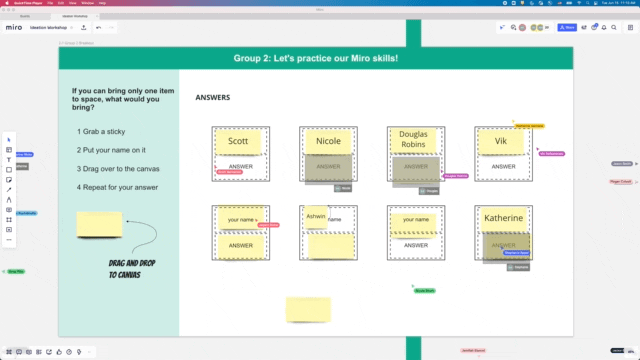
Ideation session - breakout group view
An engaging workshop means happy clients onboarded. The creative yet simple design of Miro wayfinding was part of the reasons that cleared the way for the digital team and ensured we received all the resources we hoped for.
Outlining the MVP
After an energizing workshop with plenty of innovative ideas, it's time to architect the app. I led the design team to create a sitemap that detailed 4 main features we planned to develop:
Medication - displays the user’s medication information, including pills, dosage, and instructions, with optional notification/marking features.
Delivery - tracking information for physical pillboxes
Care (deprioritized) - nurses, pharmacy contact information, knowledge center, FAQs
Me - caregiver access, preferences, billing & invoicing
Designing a low touch app
Medication management use cases
Based on our user research and expert insights learned from the workshop, I discovered two main features for medication management: reminder and tracker.
Medication management features
Medication management use cases
Depending on if the reminder and tracker get utilized, there could be four use cases that cover different levels of user engagement.
Prototyping multiple use cases
When designing different use cases for the same app, it’s essential to document the components as they are likely to have many similar states. For example, to develop the medication card, I created a tree map logic to define every form of the card by answering “yes” or “no” to each component property. Under Figma’s variance feature, the card can be easily transformed into every state:
4 use cases with respective medication card design
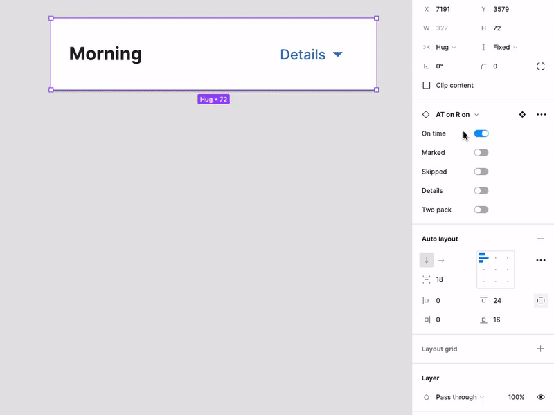
Transforming card by turning each property on and off
By doing so, I made sure the component library was clean, organized, and most importantly, MECE (Mutually Exclusive, Collectively Exhaustive)
Medication card component properties
Medication card component library
Evolving the card component
With the use cases in mind, I set out to ideate the look of the most important component in the app, the medication card. This component was constantly improved over the course of the project.
Medication card design iterations
For the elderly, screen real estate is even more precious given the number of them using a zoom factor on their devices and the accessibility requirements. Some say designing is doing subtraction rather than addition, and I concur, as a simple date indicator took me several iterations to find the simplest design.
Calendar design iterations
Most information with the least input
The most sophisticated feature of this medication management app is marking medication, as it asks for the most user input. To maximize convenience, instead of letting users individually mark their medication, patients should only mark if they took all their medication or not.

Marking medication as taken
In the “not all taken” flow, the app then asks specifically which pills they skipped and why. This design considers the fact that it’s more likely for users to either take or skip the full dose, rather than to skip a partial dose.

Marking medication as not taken
Designing beyond the app interface
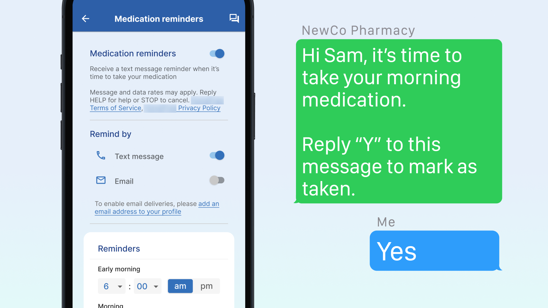
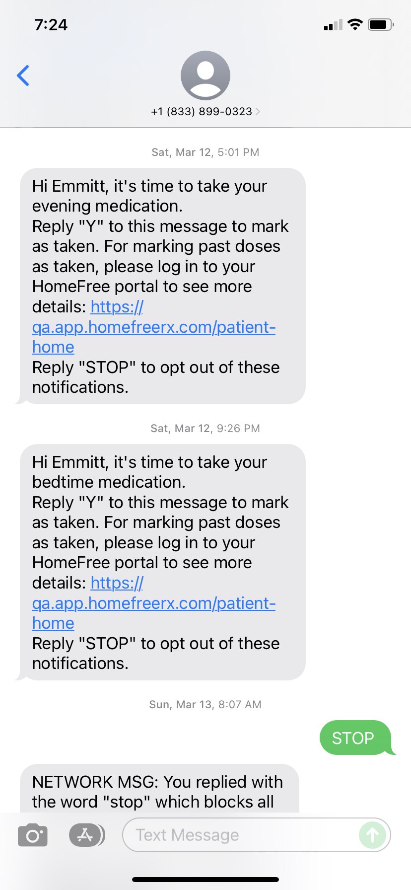
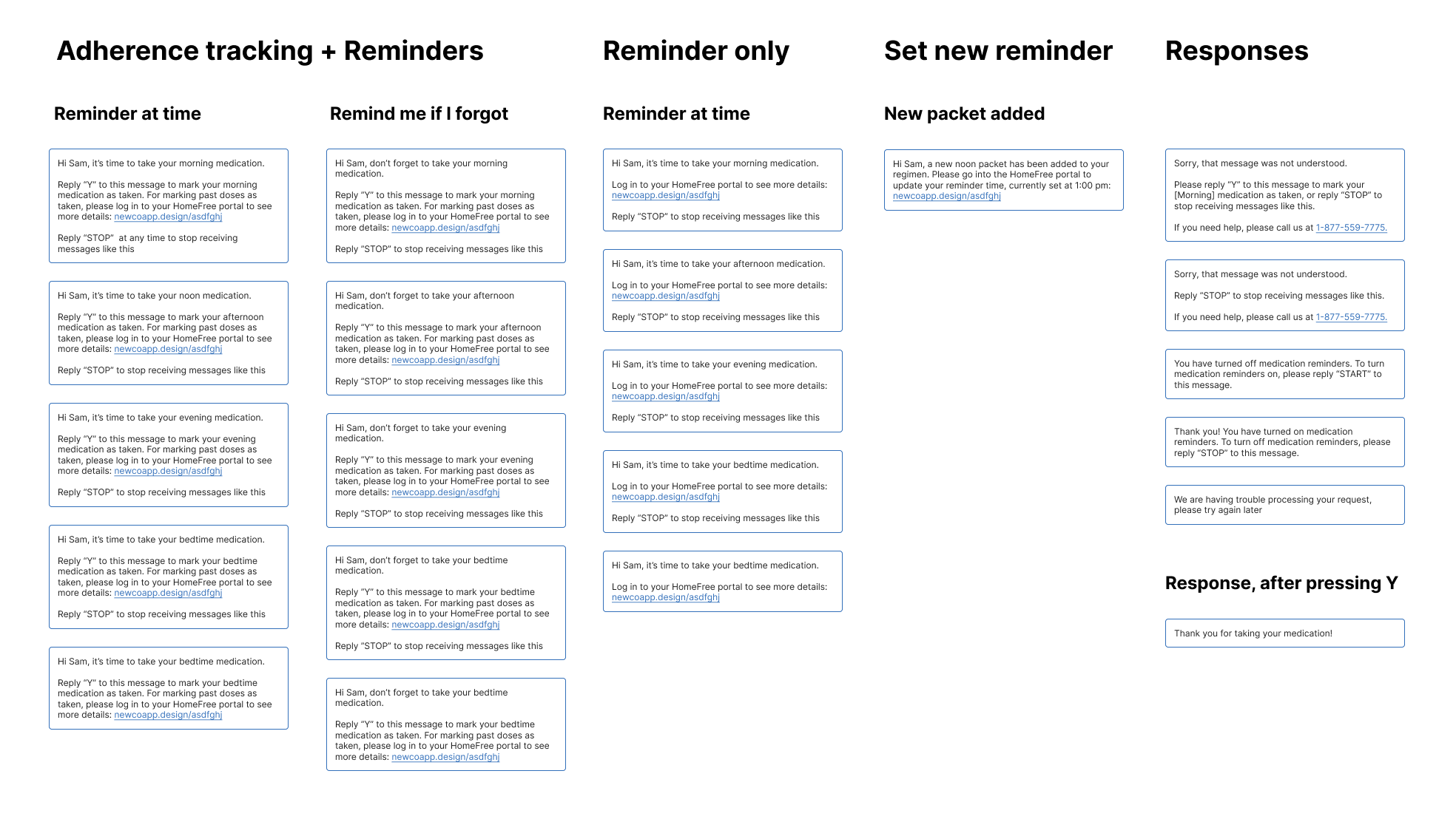
I always remember that UX goes beyond the app. For the text message feature, I carefully detailed the message and response of each scenario, ensuring patients always get the most accurate instructions.
Accessibility
Traditional KPIs no longer work for this App since our goal was not to maximize engagement. In fact, 2/4 of use cases don’t even require users to regularly open the app.
UI platter
Traditional KPIs no longer work for this App since our goal was not to maximize engagement. In fact, 2/4 of use cases don’t even require users to regularly open the app. Thus, a set of OKRs was specially designed to measure the success of the app with a heavy emphasis on accessibility and medication adherence.
Lighthouse accessibility score - sign in
Lighthouse accessibility score - landing page
Design system
A clean and organized component library is what every designer dreams of when they pick up a project. I had to start from scratch, but my successor won’t need to.
Design system
Conclusion: creating real-world impact
After 8 months of diligent work, we helped the client launch its first digital application, establishing a brand-new digital service function. The client transitioned from zero tech capabilities to a dedicated digital team with an excited Director of IT and a vendor partner to drive the tech platform and app development going forward.

“The McKinsey Team gave us a clear 6–8-month boost.”
“A big Thank You, for all your hard-work, relationships and clear commitment to live up to the high bar of holistic impact – not only growing a healthcare pharmacy but also increasing access to (safer – better adherence, lower adverse drug events and readmissions) medications for the polychronic population. ”