
Reimagining the Pathways to Net Zero
Global temperatures are rising, bringing a range of physical effects that will have high economic & social implications. McKinsey Sustainability aims to help clients achieve decarbonization in all sectors, reaching net zero by 2050. Since 2022, I worked on designing several Catalyst Zero solutions under McKinsey Sustainability practice to bring design thinking to digital asset development, unlocking the value of data models with outstanding and consistent user experiences.
“Our aim is to be the largest private sector catalyst for decarbonization”
Role:
Lead designer
Co-product owner
Key contributions:
User interface design
Design system
Data visualization
Product management
Designing for sustainability
“We are building a design team for Catalyst Zero”
McKinsey Sustainability, arguably the most knowledgeable group of people in this space, helps hundreds of clients globally to reach their net zero goals. Catalyst Zero is its solution team that develops data models to enable client service teams (CSTs) to make informed decisions on client engagements.

Defining the scope of design
Beginning with a series of research sessions, I realized that all of our data models were built on Excel by business analysts, which introduces problems for sharing, updating, version control, and scalability. I was convinced that the scope of our design work was to digitize the end-to-end workflow so that the team no longer need local tools such as Excel.
Catalyst Zero digital assets
Data model flow
Surveying development stages across data models
My first challenge after surveying all our data models is the inconsistencies of digitization effort. While some models had been digitized to some level, others were still living in Excel spreadsheets.
Knowing the inconsistencies of development stages, I decided that before any interface design work, it’s crucial to establish a design system monitored by a centralized design team.
Bringing all assets under one identity
After surveying existing data models. I realized the need for a Catalyst Zero design system, which should:
Unify design languages across internal assets
Empower collaboration between asset development teams
Ensure a strong brand identity in the market of decarbonization services
Creating UI patterns for data models
CZ-DS is not designed to be a full-fledged design system, but an appendix to the existing McKinsey design system with components specifically built for data models.

Rethinking the top navigation
One of the most requested features is to better accommodate different levels of partnership, specifically: McKinsey-owned, Co-developed, and Client-owned. Each use case was perfectly manifested by how the scrip marks were presented on the main navigation.
With CZ-DS governing the visual identity and interaction model, the updated top navigation
Considered different client partnership models
Included the main navigation, establishing a cleaner page hierarchy
Added site-level controls, such as profile, settings, notifications, etc.
Rethinking the page hierarchy
The side navigation was a completely new addition to MDS. The need for displaying a large number of charts and complicated data flows pushed me to realize the necessity of introducing additional layers of page hierarchy.
In addition to being a page menu, the side navigation was accompanied by a secondary header that supports page-wide controls, such as filters, toggles, and any CTAs. I also introduced a second layer of the sidebar to accommodate data categories.
Remapping the data input
The essence of a data model is “data”. From our user research, I learned that data tables need to accommodate various lengths, widths, scrolling behaviors, sorting, and live editing. Therefore, the data table was overhauled to ensure such maximum flexibility.
With the new table header and cell components, data tables can be shown in a modern style with better visibility.
Reimagining the data UX
A model can only be as helpful as how it was set up. On the input page, I made 3 major changes to synergize with redesigned data tables:
Side input menu
Page hierarchy
Status indicator
On the output page, where users adjust their decarbonization levers to generate different pathways, another 3 changes were made:
Placement of the control panel
Lever selector
Hierarchy of CTAs
Advancing data visualizations to the next level
Once the design system was set up, the next challenge became how we visualize quantitative information in an intuitive manner. Data visualization has always been my passion, and I was determined to leverage all my knowledge and resources to create the most effective charts for all our models.
Building responsive charts
Charts have always been the most time-consuming interfaces to design, not only for their intellectual challenges but also for the technical difficulties to edit those complex graphics. With the significant number of charts I anticipated designing across models, it was cost-effective to consider putting the effort into building a responsive chart library.
The first step is to regulate chart components so that they have a consistent format, including:
the order among title, graph, grids, and legends
Color scheme
Font styles
Calls to action
By setting appropriate grouping, constraints, and auto layout values, I built a chart library that turns all the charts we use into one responsive format. In addition to static formatting, responsive formatting fits a wide range of aspect ratios by:
Text wrapping
Auto spacing between groups/frames
Resizable charts that fit most aspect ratios
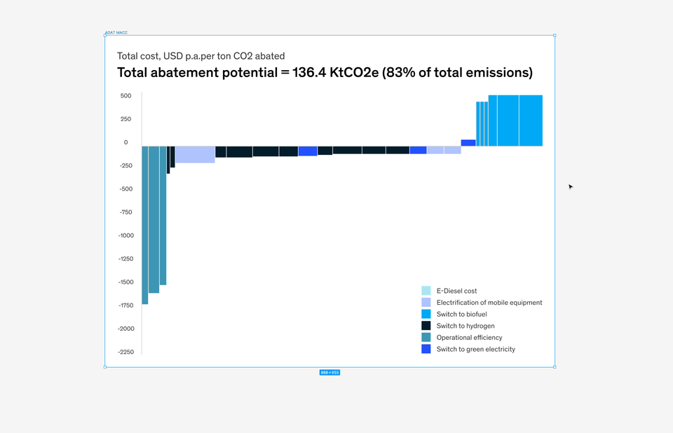
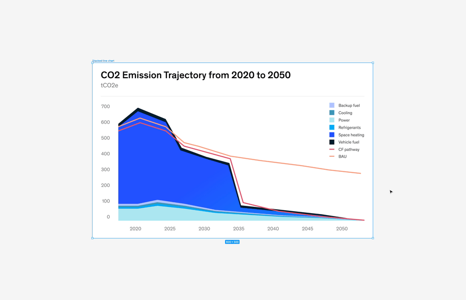
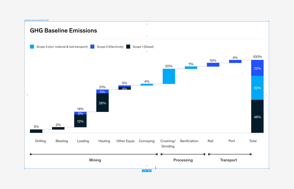
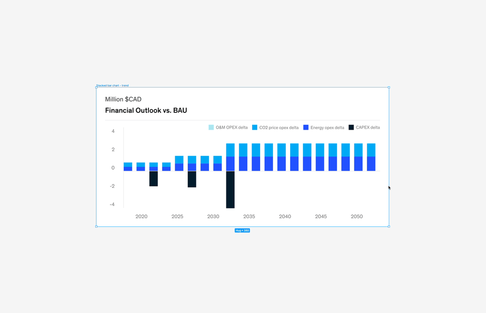
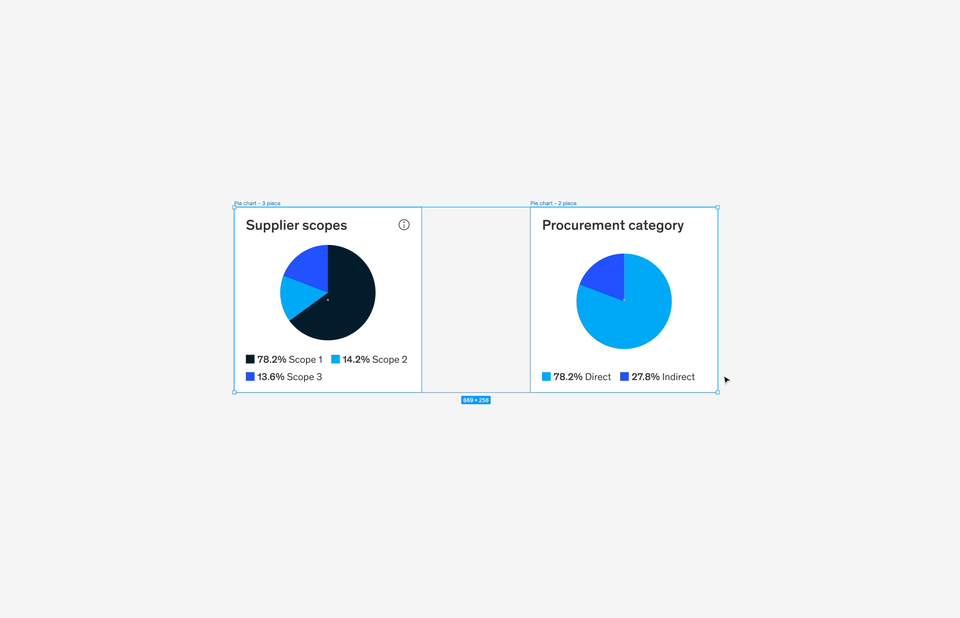
Some examples of responsive charts are:
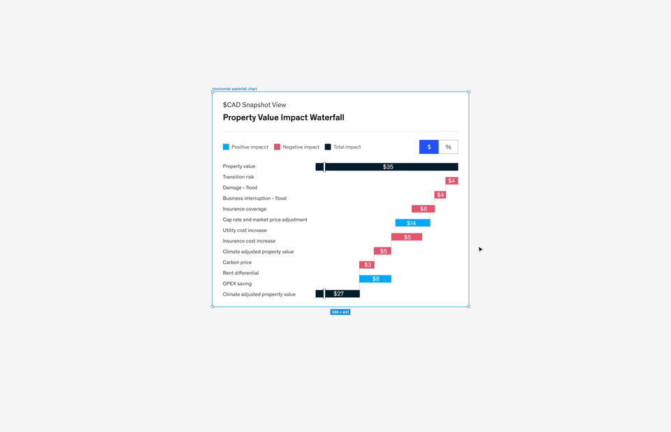
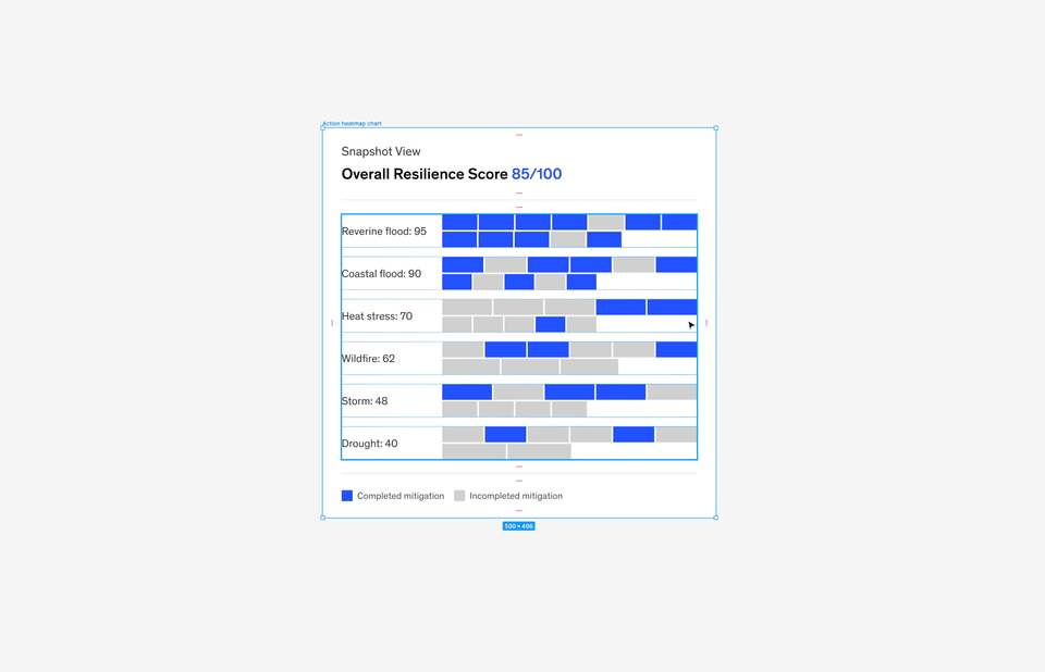
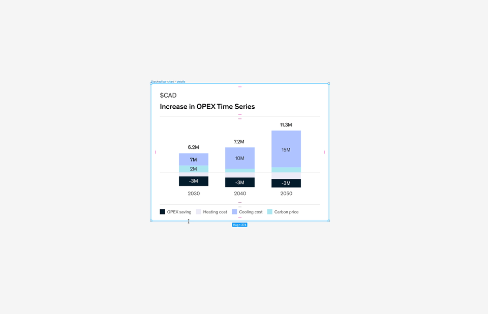
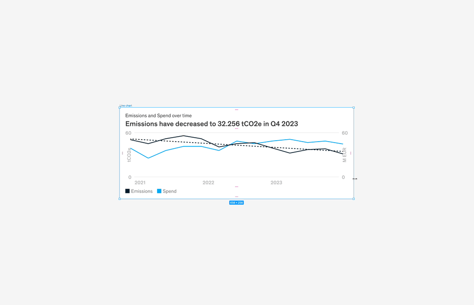
Componentizing charts
The effort of building a responsive chart library received so much praise from the design team that we decided to expand it into MDS, the firm-wide design system. With the correct component/variant setup, the chart can be interchanged with only a few clicks.
I also went the extra mile to create different levels of nesting, so designers can choose between using only the molecules or the whole chart depending on their needs
Achieving a generation leap with measurable success
As one of the largest digital asset development efforts at the firm, Catalyst Zero created its brand identity. It is continuously bringing more power and user-friendly models to new industries, accelerating the speed to achieve net zero for clients all over the world.

Example screens of Catalyst Zero digital data models:


Accomplishments
Catalyst Zero’s data models have since generated tremendous client excitement with a clean and efficient user interface design. Prototypes used in early client conversations helped McKinsey win 30% more Letters of Proposal (LOP). No longer needing to run local Excel models, the current client service teams (CST) can now service over twice as many clients as before.

With the digital enablement, client satisfaction was improved from ~85% to 95% with compliments on our technical capability, speed of analytical work, and superior user experiences.


“Catalyst Zero is one of our most powerful tools for shaping clients’ decarbonization transformations”